Background
Customer Problem
As a new product in the travel space Bright Trip's course format is unfamiliar to its users.
Our Users
Young adults 18-35 of medium & high income, living in the US, Canada, Mexico or Europe that prefer video to print.
User Goal
Make the most relevant course information available to users to help inform their purchasing decision.
Business Goal
Create a minimum viable product to help Bright Trip find product-market fit for online travel courses.
Research
Market Landscape

Frommer's, Rough Guides and DK Guides are low on video-based content and extremely high in travel education. Youtube is extremely low on travel education and extremely high on video-based content. Bright Trip aims to provide both high video-based learning and high travel education.
Contextual Inquiry Interviews
Because Bright Trip is a new concept in the travel space we observed 4 users browsing online courses on Skillshare and the same users browsing written travel guides by competitors. We distilled our findings into three main takeaways.
Comprehensive Outline
The user wants to see that the course is well built out before they purchase.
Qualified Instructors
The user wants to know whose advice they are taking. They want to learn from experienced travelers.
Recommendations
The user wants other options if the course they are looking at doesn’t feel like the right fit.
Principles
From our research, it was clear that the user wanted an experience that provides them with a quick high-level understanding of what will be included in the course. Before we started the designs we established 3 principles gathered from our affinity diagramming that would guide our decisions.
Informative
The user should be provided with the information they need to make a purchasing decision.
Simple
The user should not be overwhelmed by the interface.
Efficient
The user should be able to learn quickly and and efficiently apply what they have learned.
Design
User Journey
To solve users' unfamiliarity with the course format we focused our design efforts on the course preview page.

Exploration


Iterations
We ideated, narrowed down our directions to three concepts, and gathered feedback from users.


The reactions from user interviews showed that the users preferred the high-level callouts with the preview video as the main focus. They also reacted positively to the recommended row of courses at the bottom of the page. They reacted negatively to the long-form course overview because the preview video adequately covered everything they needed to know.
Final Screens
The final iteration was a combination of different concepts. The video course preview is featured top of page with important information like “what you’ll learn” and “about the instructor” highlighted below. We featured recommended courses last to increase the user's purchasing options.

Results
In the week following Bright Trip’s launch, they sold 600 courses at a conversion rate of 1.5%. This was 40% above the projected volume. Also, the design achieved the business goal of establishing an MVP to validate product-market fit.
With that said, there is always room for improvement. I would improve the following after gathering customer feedback and analyzing site metrics:
Make the purchase button more prominent.
The user provided feedback that the purchase button felt hidden. They appreciated that we weren’t throwing it at them, but would like to see it higher on the page.
Make the search more prominent on the page.
Similar to the purchase button, the users provided feedback that the search bar also felt hidden on the page.
Feature customer reviews.
Now that the product has launched reviews would help build trust with the users and help them in making the decision to purchase.
Potential Improvements

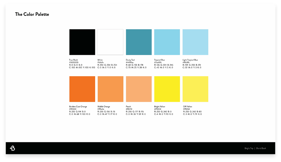
Brand Systems
Bright Trip wanted to stand on its own as a brand, but also be able to blend with its partners Lonely Planet & Booking.com. There was potential for the platform to be a white label service so we kept the brand system technical, delightful & adaptable.