Background
Customer Problem
Females seeking financial advice have limited resources tailored to them. Most available resources take an outdated approach toward women.
Our Users
Women ages 20-30 supporting themselves financially.
Goal
Create a tax education website, educational content, and resources that fit seamlessly into the busy lives of working millennial women.

My Role
Collaborators
Ash Casper - Co-Founder
Taylor Bugg - CPA Accountant
Timeframe
December 2018 - January 2019
GoDutch is a digital platform offering tailored financial education for women. Transforming complicated principles into digestible resources.
Co-founder, product design, product strategy, brand design, content design. You name it, we did it.
Research
Secondary Research

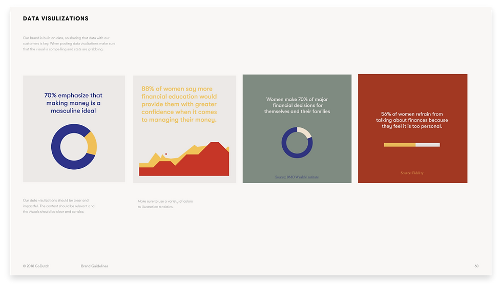
The majority of women lack confidence when it comes to discussing money, and 88% of women say more financial education would provide them with greater confidence when it comes to managing their money. (3)
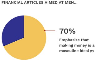
A Starling Bank study looked at 300 articles and researchers found that women were defined as “excessive spenders” across 65% of the articles aimed at them. (4)
(1) Source: Mercer, (2) Source: Starling Bank, (3) Source: Fidelity, (4) Source: Starling Bank
Interviews
We interviewed 20 working women, age 20-30, supporting themselves financially.

Iz Harris Quote
“I don’t even know where to start. I just want something that covers the basics and if I want to learn more then I’ll ask my accountant.”

Taylor Rippy Quote
“I work long hours, I need something that I can take a look at on my breaks. Something that refreshes me and doesn’t make me feel more stressed about money.”

Mackenzie Rands Quote
“I read a lot of articles, but it would be nice to have a curated place I can go to receive news. Something that feels like I am part of a community.”
Personas
Drawing on our conversations with our demographic we developed the following user personas.
Maya
She has a job that she likes, but isn’t inspired by. She likes to spend. She indulges in lifestyle growth.
She calls her dad for
financial advice.
Erica
She’s paid hourly in the service industry. No current career plan. Very hard worker. She works to pay the bills.
She gets financial
advice from friends.
Jane
Obsessive planner. Seeks financial independence. Clear career goals. Likes to save.
She is constantly
searching for accessible
financial resources.
Research Insights & Summary
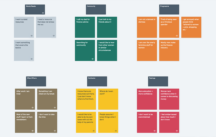
Simple & Straightforward
This is the heart of the product. If we don’t stick to simplicity the user will be lost.
Progressive
Being a woman means something different for every user. Outdated stereotypes are not welcome here.
Approachable
There are no dumb questions. We will start from the beginning and grow together as a community.
From our research, it was clear that the user wanted a simple delivery system, not overly-feminine visuals, & approachable messaging. Before we started the designs we established 3 principles gathered from our affinity diagramming that would guide our decisions.
Design
Exploration


We took a broad approach to exploration. We explored everything from a search based thesaurus to a full-blown dashboard experience.
Iterations
We narrowed down our directions to three concepts. We then showed them to users to get feedback on which version best suited their needs.


Finding the right balance between a great experience and time and budget constraints was our biggest challenge. Although users reacted positively to concept #3 we had to save that iteration for if/when the brand had a larger budget. Users reacted negatively to concept #1, they felt a search bar was challenging because they weren't sure about the topics they wanted to learn and wanted more guidance. The user's reacted positively to concept #2 because they were able to look through different terms and build from there. We ended up incorporating the recommended resources from concept #3 into concept #2 and created a content library of financial terms & resources. All simple, progressive, and approachable.
Final Screens
Some rationales behind our decisions
-
We wanted to prioritize the user's feedback and guide them through topics and resources.
-
We prioritized what could bring the most value to the platform within the constraints of time & budget.
-
We want the brand to stand out and provide users with a unique female-tailored experience.
-
We wanted to make sure the design was simple and made information easily accessible.
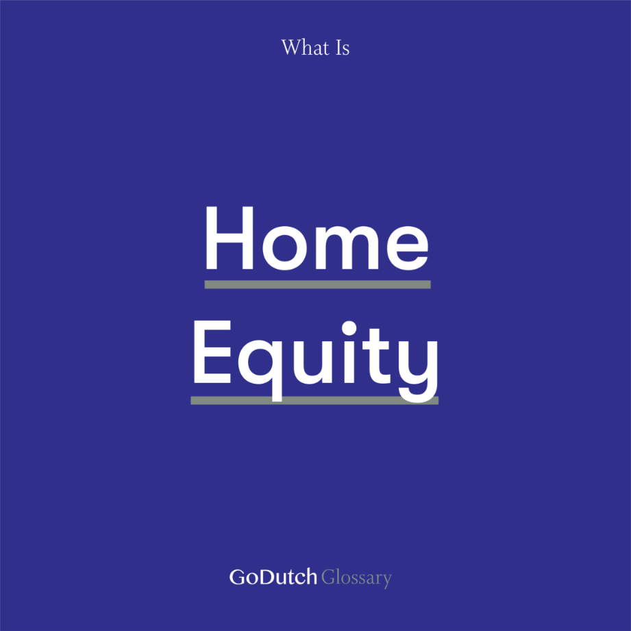
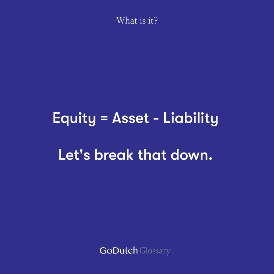
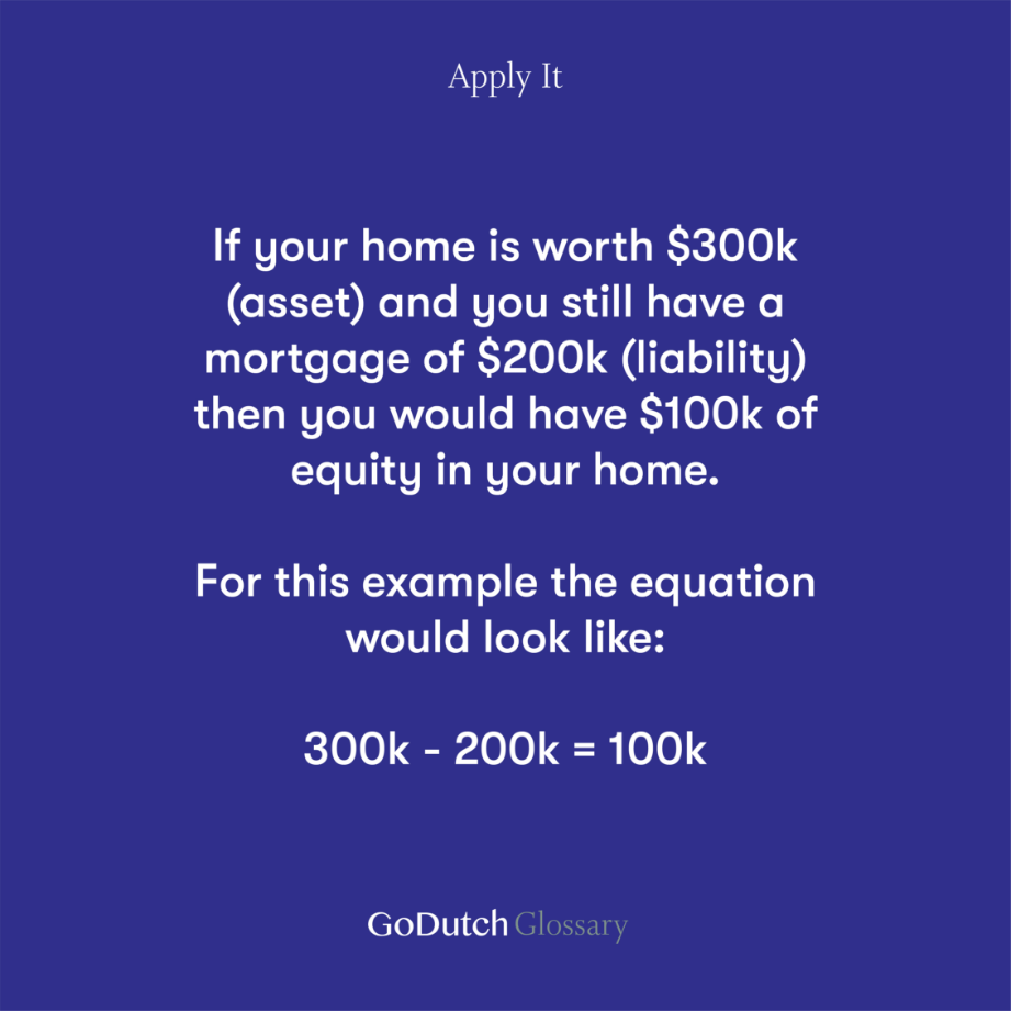
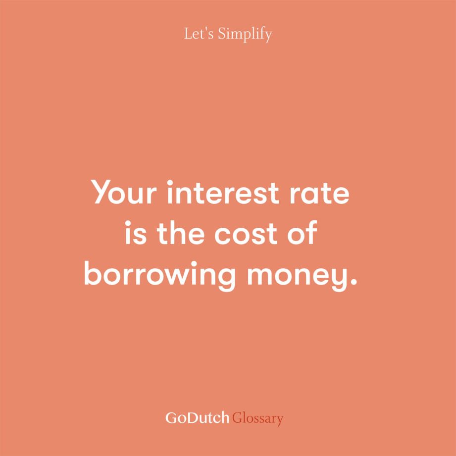
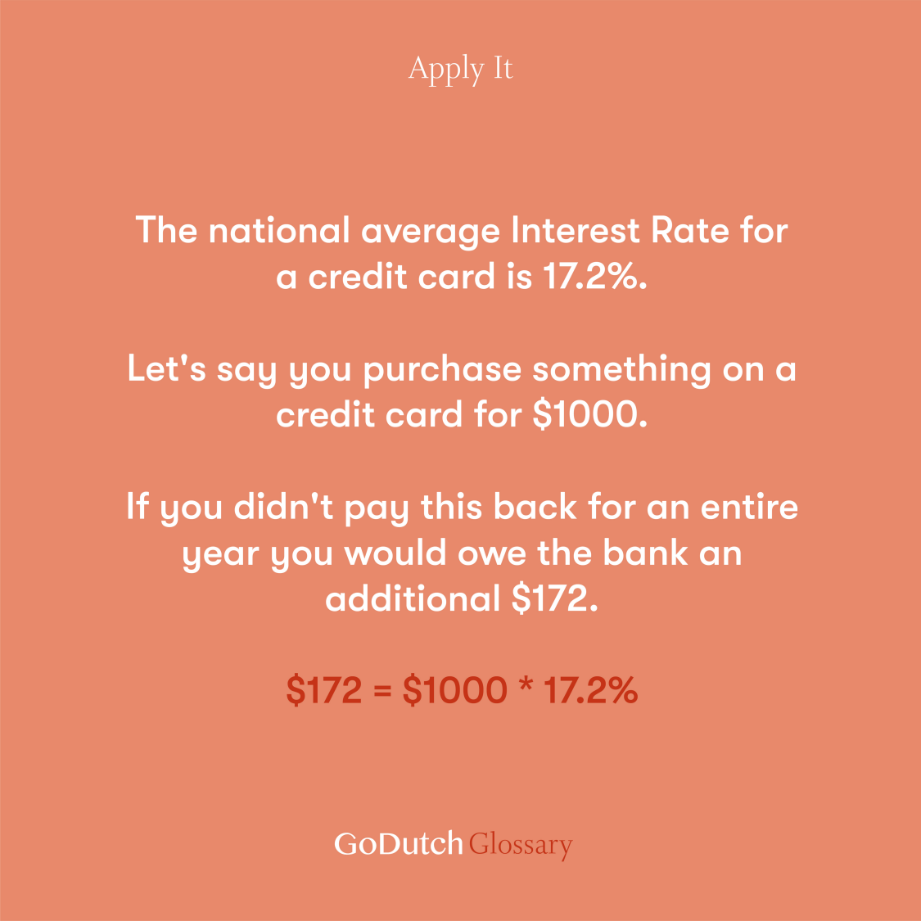
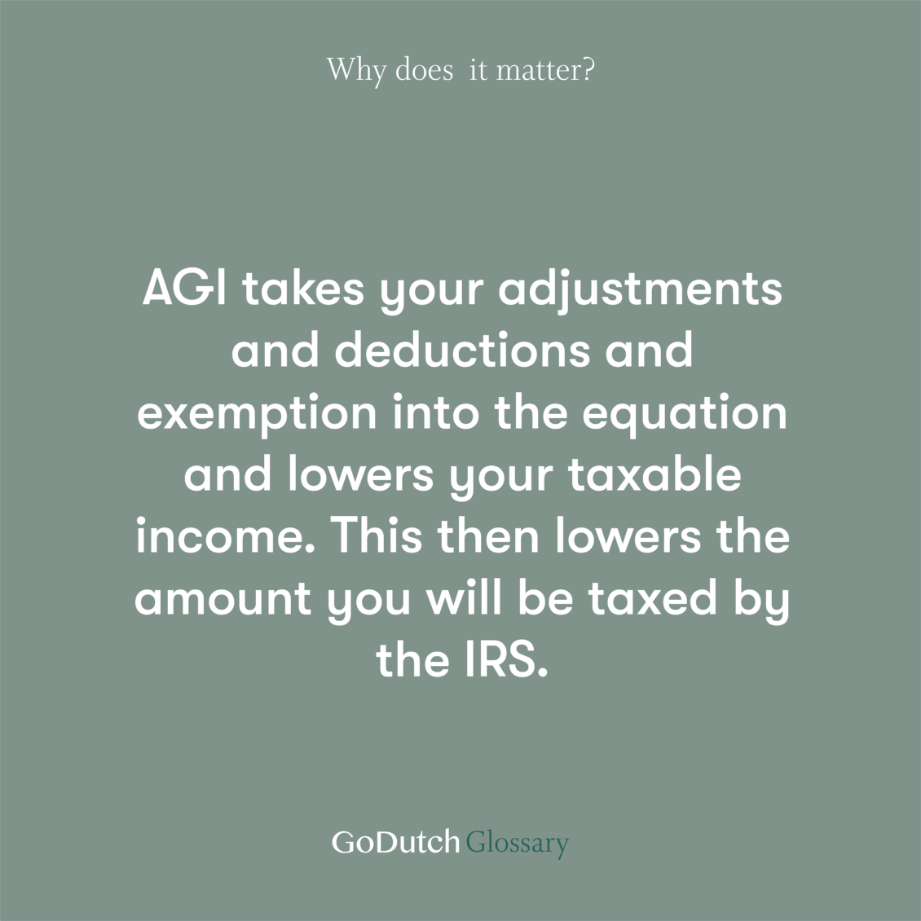
Content
Take a closer look at the content we created.


Results
In the span of a few months, we reached thousands of women through the microsite, social media, and events.
Our inbox was flooded with messages from women expressing how helpful our resources had been.
Our analytics showed a bounce rate of 39% and a signup rate of 8% which was a great start: however, users wanted more. They were reaching out asking when we were going to provide a more personalized approach.
Brand System
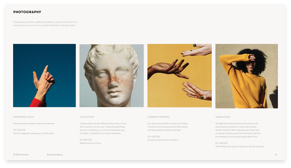
The repetitive nature of the product structure (i.e. financial definitions, shared resources and data visualizations) required a large library of brand assets. A wide variety of color, type & illustrations made daily content feel fresh & relevant.